
CLIENT: Sustain
TIMELINE: 2 weeks
ROLE: UX/UI Designer
TOOLS: Sketch, Invision, Marvel
Sustain
THE PROBLEM: Each year in the U.S., tons of food are thrown away before being eaten. Sustain wants to change this by giving a more user-centric approach to their app, adding features and flows that make it delightful for people to use so they can better manage their groceries.
THE SOLUTION: Design a mobile app that will help users efficiently track the food they have and reduce their overall food waste.

track expiration dates
Easily view and manage when food will expire.
As soon as a user logs into the app, they will be taken to the home screen, which shows an overall dashboard of items they should pay attention to, with the first being foods that are close to its expiration date. Users can also manage the expiration date of a food item by going to that individual item and editing the content.

use the barcode scanner to add items
Update your inventory within a few minutes.
Users can easily begin to start taking inventory of all the existing items in their fridge, pantry, or freezer by using the barcode scanner to quickly register them. Items can then be updated to reflect accurate quantity and expiration date before being added to their inventory.

discover recipes using your ingredients
Manage food waste by seeing what you can cook with leftovers.
Users can find hundreds of recipes based on ingredients currently in their inventory. Each recipe will display a high level overview of ratings by other Sustain users and the estimated time it takes to make. Users can also add recipes to their collections to save for future reference.
Research
OBJECTIVE: Identify demographics and trends of the food industry
PROCESS: Market Research | Competitive Analysis | Interviews
MARKET RESEARCH
I conducted research to learn more about the food industry and its trends and challenges, including the issue with food waste. I discovered that the main reasons food waste occurs is because of purchasing and preparing too much food, lack of appropriate planning, and food not being eaten before it spoils.
INDUSTRY:
A report by the Natural Resources Defense Council stated that the residential sector was estimated to produce the most food waste, followed by restaurants and caterers.
The importance of fresh products in consumers’ diets, along with buying habits, keep shoppers returning to stores to restock their shelves and fridges.
Confusion over “best by,” “sell by,” “use by,” and other date labels leads Americans to throw away an estimated $29 billion of safe food every year.
Consumers who follow a healthier diet are the most wasteful: Fruits and vegetables and mixed fruit and vegetable dishes account for 39% of food waste, followed by dairy (17%), meat and mixed meat dishes (14%), and grains and grain mixed dishes (12%).
DEMOGRAPHICS:
Gen Z shoppers (18-21) spend the least on groceries each month, averaging $269. Forty-two percent of Gen Z shoppers use a digital grocery list.
Millennial shoppers (22-36) spend an average of $298 per month on groceries. Sixty percent of Millennial shoppers use mobile apps for grocery coupons or discounts, a considerably higher rate than any other generation.
Gen X shoppers (37-52) spend the most each month on groceries, averaging $380. Many shoppers in this demographic have adopted digital grocery tools: 70 percent said that they redeemed a digital or mobile grocery coupon within the past month.
Boomers (53-71) spend an average of $314 a month on groceries and are brand and grocery store loyal.
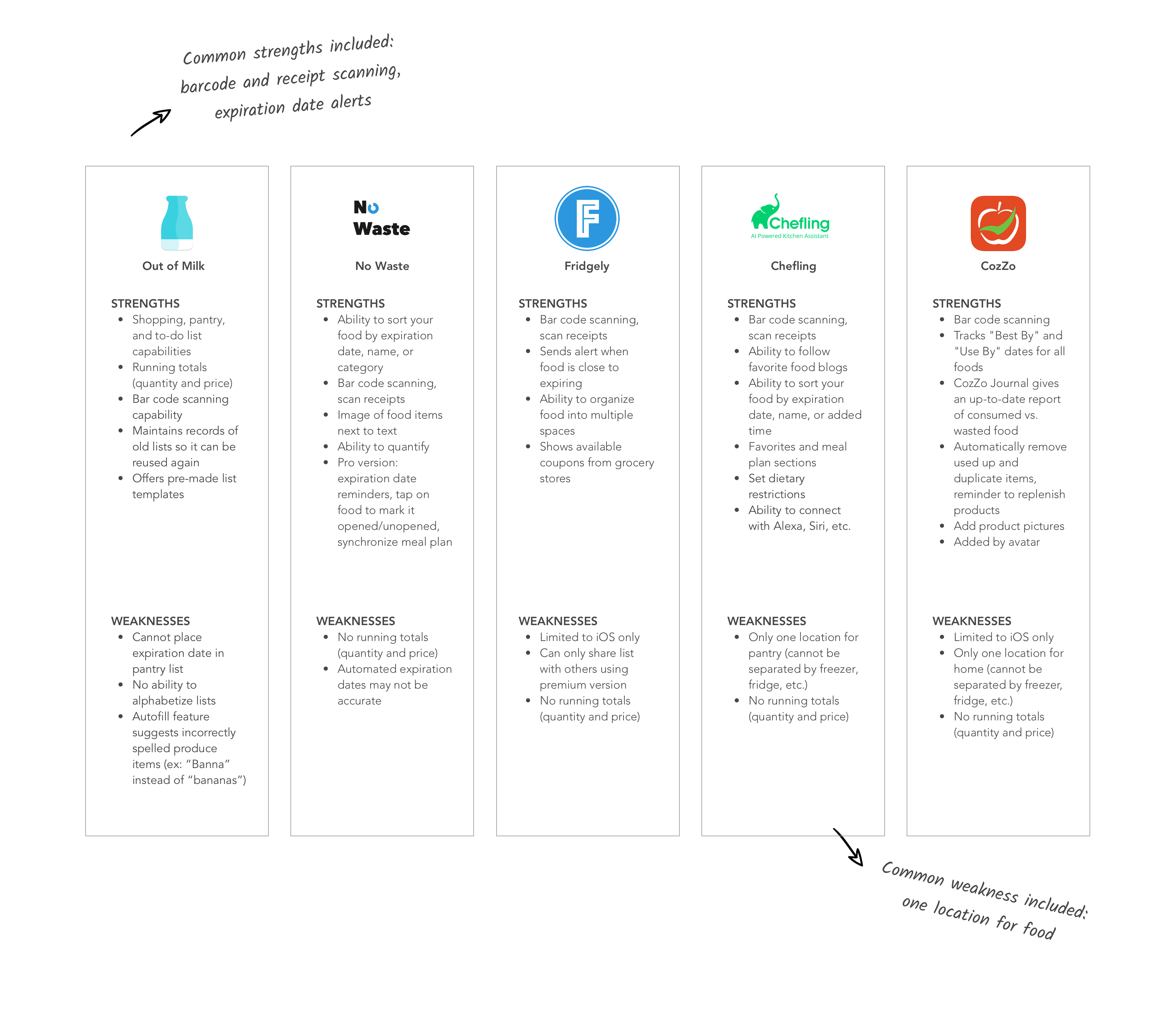
COMPETITIVE ANALYSIS
Following my market research, I conducted a competitive analysis to compare strengths and weaknesses of competitors similar to Sustain. Doing so helped me recognize common design patterns and service offerings and how I could distinguish Sustain from its competitors.
USER INTERVIEWS
After learning more about the food industry in general and other food management apps, I went to a local coffee shop to find target Sustain users to understand what users' motivations, frustrations, behaviors, and experiences were when it comes to managing their fridge and groceries. I conducted in-person interviews with people who frequently grocery shop.
INSIGHTS:
Number of participants: 5
Gender: 2 males, 3 females
Age range: 25-37
define
OBJECTIVE: Analyze observations and synthesize them to define the target user
PROCESS: Empathy map | Persona | POV Statements and HMW Questions
EMPATHY MAP
After speaking with the Sustain’s target users, I created an empathy map to visually organize my findings from my interviews into various groupings as a way to help me observe patterns more easily and identify what the needs of users were.
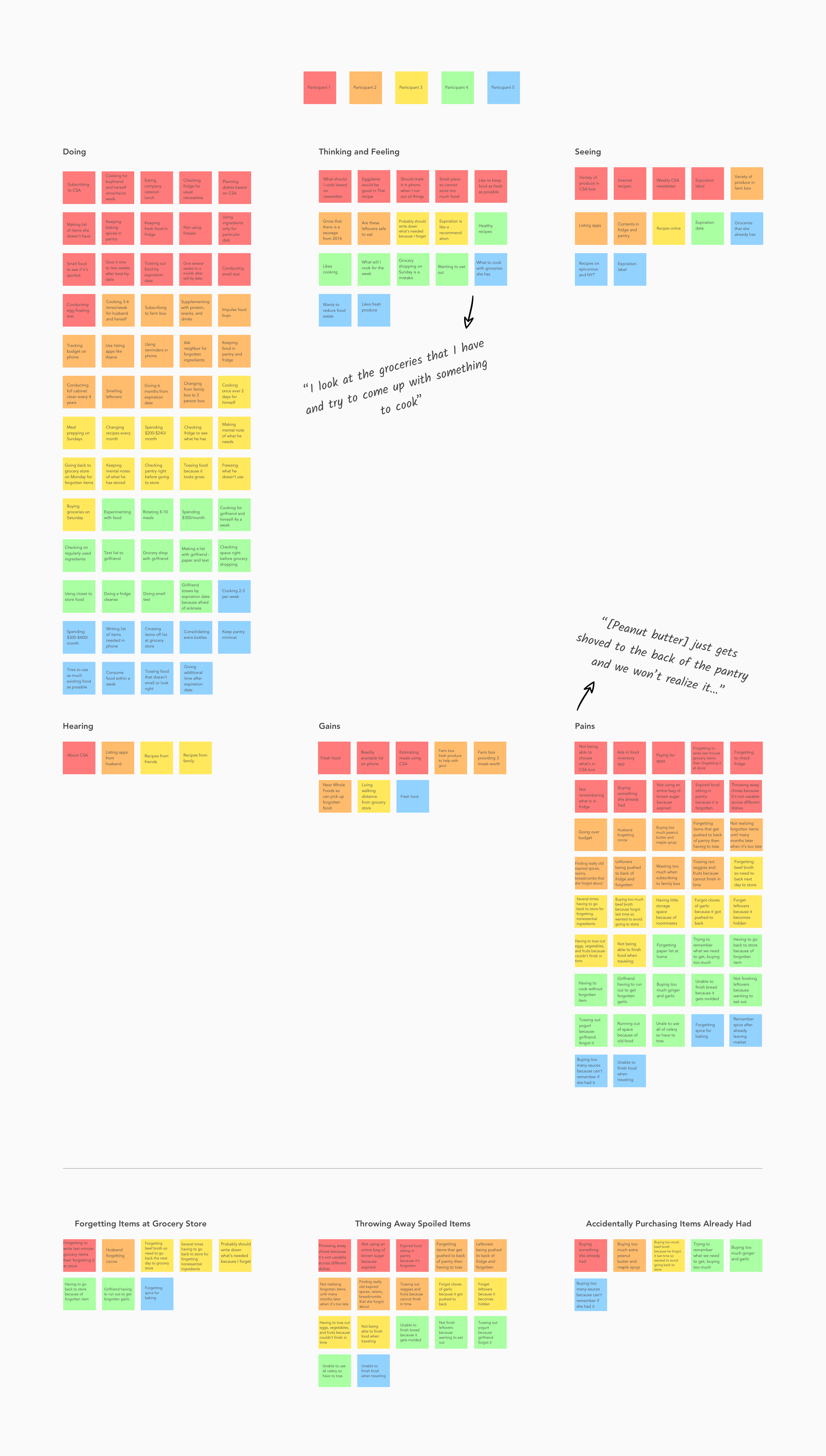
INSIGHTS:
People forget items while at the grocery store.
People regularly throw away items that are spoiled.
People accidentally repurchase items they already had.
NEEDS:
To remember all the groceries they need to buy.
To be able to use groceries before it perishes.
To track what items they currently own.
PERSONA
Taking the insights I drew from my empathy map, I created a persona named Elaine Greene. Elaine represents Sustain’s target customer as someone who tries not eat out too often and is managing groceries with her husband. Through personifying the interview findings, I am able to ensure that all design decisions are made with Sustain’s target user in mind.

POINT OF VIEW STATEMENTS AND HOW MIGHT WE QUESTIONS
After defining the target user of Sustain, I moved onto creating point of view (POV) statements framing the user's insights and needs. These statements helped me to form my "How Might We" (HMW) questions by better defining the problems I need to solve for through my design.

IDEATE
OBJECTIVE: Brainstorm potential features, information architecture, and flows
PROCESS: Product Roadmap | Application Map | Task Flow | User Flow
PRODUCT ROADMAP
Using the HMW questions, I conducted a quick brainstorming activity and chose features to prioritize for each of Elaine’s needs based on feasibility and impact on the user. This made it easier to focus on a few key features for Elaine’s needs, rather than designing too many features at once.

APPLICATION MAP
After identifying the key features I will be incorporating into the design, I created an application map to represent how the content could be laid out for users to intuitively navigate the Sustain app.

TASK FLOWS
To identify the specific steps a user would take to interact with the features outlined in the product roadmap, I created several task flows based on Elaine’s needs. These flows provide insight to the thought process of a user completing the task and helps me understand how to prioritize content.

USER FLOWS
To help me understand the best paths for optimization, I created a user flow to portray all potential paths Elaine could take to complete her tasks by expanding upon my task flows. The flow below outlines one scenario:
Elaine notices her apple juice is running low and decides to add it to her grocery list using the barcode scanner feature to save herself time (path highlighted in green color).
See the complete user flow diagram with all scenarios here.

design
OBJECTIVE: Design mid-fidelity wireframes for the app
PROCESS: Sketches | Mid-Fidelity Wireframes
SKETCHES
Before diving into digitally designing the app, I began sketching out potential ideas for the basic layout of what the app could look like. I took inspiration from other inventory management apps as well as mobile common design patterns.

MID-FIDELITY WIREFRAMES
From the sketches, I was able to gain valuable feedback from others regarding the flow and UI elements before digitizing wireframes in Sketch. While constructing the wireframes, I took into account Apple’s Human Interface guidelines in addition to the feedback I received.

prototype
OBJECTIVE: To prototype the app and obtain feedback based on usability tests
PROCESS: Mid-Fidelity Prototype | Usability Testing
MID-FIDELITY PROTOTYPE
Before moving into a high-fidelity version of the app, I created a functioning mid-fidelity prototype via Sketch and InVision to see how target Sustain users would interact with the app. See the mid-fidelity prototype here:
USABILITY TESTING
I set up camp at a coffee shop again to search for participants to test my mid-fidelity prototype. I was able to test 5 participants who frequently grocery shop. I asked the participants to complete different tasks based on various scenarios while they described to me what they were doing, why they were doing it, how they felt about it, etc.. Based on this, I was able to collect valuable information and insight from my target users.
OBJECTIVES:
Observe how users navigate through the Sustain app and complete tasks.
Determine if users are able to complete tasks successfully and with ease.
Identify any pain points that causes frustration or confusion for users when completing tasks.
TASKS:
Log into the app.
Find recipes based on the ingredient you already have.
Update your inventory to reflect the change in your egg count.
Add apple juice to your shopping list.
Iterate
OBJECTIVE: Iterate design based on patterns in usability feedback
PROCESS: Affinity Map | Branding | High-fidelity Wireframes and Prototype | UI Kit
AFFINITY MAP
I created an affinity map to synthesize the usability findings, identifying patterns in behaviors and feedback. Then, I drew insights and formed recommendations for the next iteration of the design. The insights were mainly focused on not being able to immediately locate a feature.

INSIGHTS:
Users struggled to locate where they can find recipes based on the ingredient they had.
Users struggled to find the add button when adding new items to the shopping list.
RECOMMENDATIONS:
Place recipes based on ingredients under the “My Recipes” tab.
Increase size of add button and center align (rather than right align).
BRANDING
Before creating high-fidelity wireframes, I first defined Sustain’s branding to ensure that it’s cohesive with its brand attributes which are minimal, modern, friendly, and simple.

HIGH-FIDELITY WIREFRAMES AND PROTOTYPE
I created high-fidelity wireframes to include the branding and reflect the recommendations from the affinity map. Some of the main changes I made are shown below. Interact with the complete high-fidelity prototype below:

UI KIT
As I was working on creating my wireframes and prototype, I maintained a UI kit for future reference.

Reflection & next steps
FINAL THOUGHTS
Sustain was the first app I had to design from scratch and it was difficult to avoid constantly tweaking the design. I had to keep reminding myself that although this project was only set for a time limit of 2 weeks, designing an end-to-end mobile application would take much longer and require more resources.
Despite the challenges, this project helped me understand the importance of creating a solid foundation to address users’ needs to serve as the groundwork of building out the rest of the app.
NEXT STEPS
Continue building out additional screens.
Conduct additional testing with high-fidelity prototype.
Make improvements on the design based on user feedback.
Work with developers to create the app.


