
CLIENT: WorkshopSF
TIMELINE: 2 weeks
ROLE: UX/UI Designer
TOOLS: Sketch, Invision
WorkshopSF
THE PROBLEM: Located in San Francisco, WorkshopSF believes in creating fun, affordable experiences through adult DIY classes taught by local teachers, makers, artists, foodies, and DIY’ers. Their current website is not mobile responsive and can be frustrating to use when locating and signing up for a class. Their brand identity is also not reflective of the experience customers feel when taking a class.
THE SOLUTION: There aren’t many craft classes offering as diverse of classes as WorkshopSF so re-establishing their presence by creating a responsive site that is easy to navigate through and a branding identity that aligns with WorkshopSF’s customer experience would help showcase all the amazing classes they have to offer and attract more people to sign up.

Easily find your class
Search for your class or view the types of classes WorkshopSF has to offer using the class filter.
With the feature to filter classes by category, it’s easier for users to search for the classes they’re interested in, rather than having to read through an entire page filled with every class’s lengthy descriptions (listed in no particular order). Each class is now displayed with a title, an image of the project, cost, and a link to read the full detail, making it simpler for users to view.

view class availability
View how many seats are left or if the class is completely full before signing up.
Previously, a user would need to click “Sign Up For This Class!” And be taken to a separate check out page, to then realize at the bottom of the page that the class is already sold out. Now users can see how many seats are available in the class when they view the details on the class page or on the class calendar.

View the site on other devices
The site will now respond according to what device is being used to view it.
With the redesigned, fully responsive site, users can look for their classes without having to maneuver their phone or tablet to read the screen at the proper size. This is a necessity for businesses as the use of mobile is growing and users should be engaged on their preferred device.
Research
OBJECTIVE: Identify demographics and trends of the crafting industry
PROCESS: Market Research | Competitive Analysis | Interviews
MARKET RESEARCH
To understand more about the needs and frustrations of the users I would be designing for, I needed to understand the crafting industry as well as people’s current crafting behaviors. Below are some notable findings from my market research:
INDUSTRY:
The largest percentage of crafters (41%) are Millennials between the ages of 18-and-34 years old.
Females made up an average of 64% of the crafter population, with males making up 36%.
The size of the creative industry in the United States was $44 billion in 2016, up from $30.1 billion in 2011.
TRENDS & CHALLENGES:
As Millennials continue to value “experiences over things,” subscription boxes are gaining traction.
Pinterest and online courses such as Skillshare.com and Youtube.com serve as online resources for crafters instead of attending a formal classroom.
National chain stores such as Joann’s Fabrics opened locations where crafters can take classes and furnished it with high tech/high touch features like touch screen kiosks.
COMPETITIVE ANALYSIS
It was important to understand how WorkshopSF compared to other businesses offering similar services and identify any areas of strengths and opportunities for improvement. Doing so allowed me to understand the expectations of WorkshopSF’s customers and identify opportunities within the market. The Crafter’s Box and AirBnB weren’t exactly direct competitors but based on my primary research, I discovered that they offered a different kind of experience to crafters.

USER INTERVIEWS
With a better understanding of the crafting industry, I set up post at Matching Half, a coffee shop located right outside the studio to find former WorkshopSF customers and hear about their experiences.
I was able to conduct 5 in-person interviews, consisting of open ended questions to obtain a deeper understanding of how participants discovered WorkshopSF and their experiences with the classes and their site. In addition, I made observations about the environment and talked to locals about the studio. This helped me to better understand WorkshopSF’s customers and their needs, frustrations, and motivations as well as how WorkshopSF fit within the local neighborhood.
define
OBJECTIVE: Analyze observations and synthesize them to define the target user
PROCESS: Empathy map | Persona | POV Statements and HMW Questions
EMPATHY MAP
To synthesize my findings from my interviews, I transcribed all my data and organized them into groups so that I could observe the common patterns and determine their insights and needs.

INSIGHTS:
People enjoy participating in crafts with others.
People appreciate variety of class offerings.
People want to know if specific classes are sold out.
NEEDS:
To have a way for others to take crafting classes with them.
To understand what type of classes are available.
To have a resource to determine class availability.
PERSONA
To represent my findings based on the empathy map, I created a persona named Anna who is a cumulation of the common characteristics of my interview participants. Anna will help me to better empathize with users throughout the design and decision making process.

POINT OF VIEW STATEMENTS AND HOW MIGHT WE QUESTIONS
After defining my target user, Anna, I moved on to translating my insights and needs to frame Anna’s point of view so that I can define the problems I am going to solve for. I then translated these point of view statements into “how might we questions…?” so that I can begin the ideation process.

IDEATE
OBJECTIVE: Brainstorm potential solutions, organization of content, and flows
PROCESS: Product Roadmap | Sitemap | Task Flow | User Flow
PRODUCT ROADMAP
After generating my POV statements and HMW questions, I began to brainstorm solutions that I could solve for through my design. I then narrowed those solutions and selected the features that would best address each of my HMW questions, taking into consideration practicality and impact on my users. The roadmap helps me to focus on features that would solve for Anna’s needs.

SITE MAP
Based on my interviews and existing design patterns of WorkshopSF’s competitor sites, I created a sitemap to help visually outline how information would be organized and how each screen would be connected to others to ensure a better understanding of the interactions within the site.

TASK FLOWS
To demonstrate how Anna would interact with the WorkshopSF site, I created two task flows based on her needs to help define how she would go about searching for what classes WorkshopSF has to offer and determining class availability.

USER FLOWS
To further analyze how Anna would search for and book a class, I created a user flow to portray all potential paths she could take to completing her task. This allowed me to understand how pages should be organized based on its relationship with other pages as well as context and potential barriers. The flow below outlines two scenarios:
Anna hears about WorkshopSF from a friend that highly recommended it for their fun, unique classes. She decides to check out their site and see what type of classes they have to offer (path in highlighted in yellow color).
Anna wants to take a floral arrangement class. She decides to Google “Floral arrangement class San Francisco” and comes across WorkshopSF’s home page. She browses through the site for the class and decides she wants to book it for when she is available (path highlighted in purple color).

design
OBJECTIVE: Design the brand and user interface of WorkshopSF’s site
PROCESS: Sketches | Mid-Fidelity Wireframes
SKETCHES
To begin the design process, I sketched low-fidelity wireframes of what the various pages of WorkshopSF could look like. Starting off with sketches allowed me to quickly lay down my ideas and gather feedback on my designs without investing too much time.

MID-FIDELITY WIREFRAMES
After making updates to the initial sketches, I used Sketch to digitize a desktop, tablet, and mobile version of the pages. This allowed me to layout the visual hierarchy of the WorkshopSF site and focus solely on the elements in the page rather than any visual styling.

prototype
OBJECTIVE: Prototype the WorkshopSF site and to obtain feedback based on usability tests
PROCESS: Mid-Fidelity Prototype | Usability Testing
MID-FIDELITY PROTOTYPE
Before I could see how real users would interact with the WorkshopSF site, I created a functioning mid-fidelity prototype via Sketch and InVision. This allowed me to test the structure of the site without any distractions from visual elements. See the mid-fidelity prototype here:
USABILITY TESTING
To determine the ease of use of the WorkshopSF site, I conducted in-person usability tests using my mid-fidelity prototype on 5 participants who have similar characteristics as our persona, Anna. I was able to gather insightful feedback based on observation of our target users.
OBJECTIVES:
Observe how users navigate through the website and complete tasks.
Determine if users are able to complete tasks successfully and with ease.
Identify any pain points that causes frustration or confusion for users when completing tasks.
TASKS:
Find out what type of classes WorkshopSF offers.
Find out if WorkshopSF offers floral arrangement classes.
Book the floral arrangement class for a day during which you are available.
Iterate
OBJECTIVE: Iterate design based on patterns in usability feedback
PROCESS: Affinity Map | Branding | High-fidelity Prototype | UI Kit
AFFINITY MAP
Based on observations from the usability test, I created an affinity map to organize my observations on users' behaviors and common patterns and took the insights and translated this to recommendations to be built in the next iteration of the prototype.
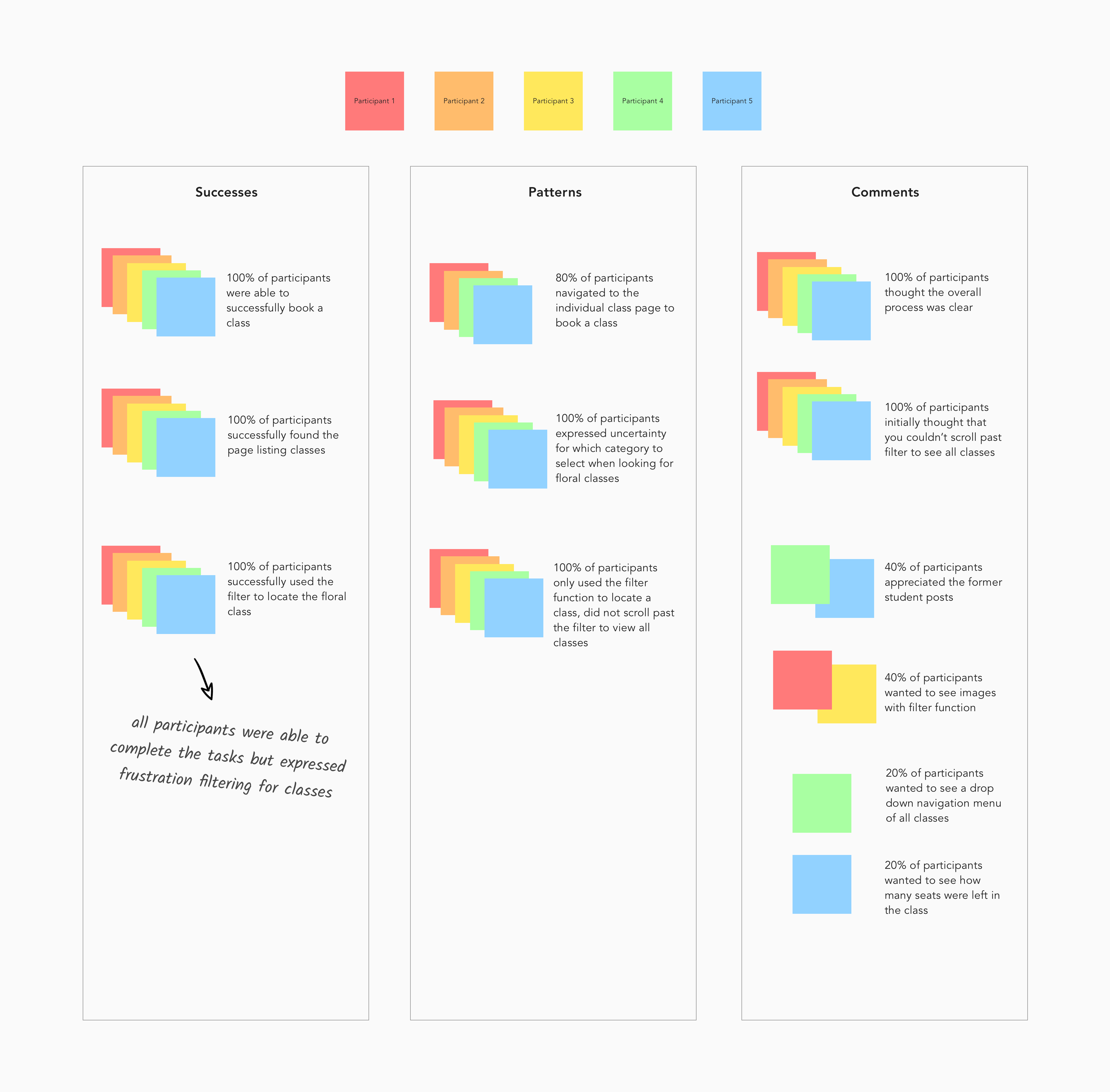
INSIGHTS:
Users have trouble determining what classes fall under each category.
Users did not initially realize they were able to scroll past the hero image section to view additional details on class menu page.
RECOMMENDATIONS:
Relabel categories to make it more intuitive.
Place filter function below hero image so hero image is consistent with other pages.
BRANDING
Before transitioning the mid-fidelity wireframes to high-fidelity, I created a branding guideline to ensure that the core characteristics of WorkshopSF were represented: creative, unique, friendly, industrial, and down to earth.
I chose black and gray for the branding colors to represent the industrial brand attribute and turquoise as a highlight color to represent the down to earth and friendly attributes. I felt it was important to choose a balance between these attributes to show that WorkshopSF was a place to get your hands dirty yet have fun with others while doing it!

HIGH-FIDELITY PROTOTYPE
Using the style tile as my foundation, I brought my mid-fidelity wireframes to life by adding visual elements to the layouts. See the complete high-fidelity prototype here:

UI KIT
As I was working on finalizing my designs, I created a UI kit containing all the visual elements used throughout the pages to serve as a reference for future work.

Reflection & next steps
FINAL THOUGHTS
Given that crafting is a niche industry and WorkshopSF is a unique organization in particular, this project taught me the importance of research and basing design decisions off of real customers’ experiences. It also gave me insight into the significance of information architecture, particularly with sites that hold a large amount of content.
My main takeaways were improving my responsive web design skills and developing branding that aligns with user expectations.
NEXT STEPS
Continue iterations based on additional testing.
Begin building site myself or hand off designs to developers.
BEFORE

AFTER


